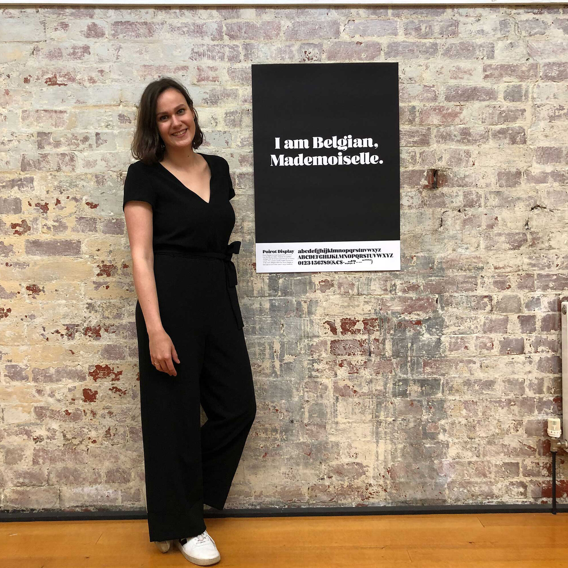
Poirot Display is the typeface I designed during a Type Design course at the OSNS for Design & Typography in Melbourne, Australia (2018). The typeface originated from a sketch that was initially intended for a (fictional) ice cream parlor. I started from the idea of an ice cream shop on the pier in San Francisco. Over the weeks, the letters evolved into a typeface and ‘Poirot display’ was born.


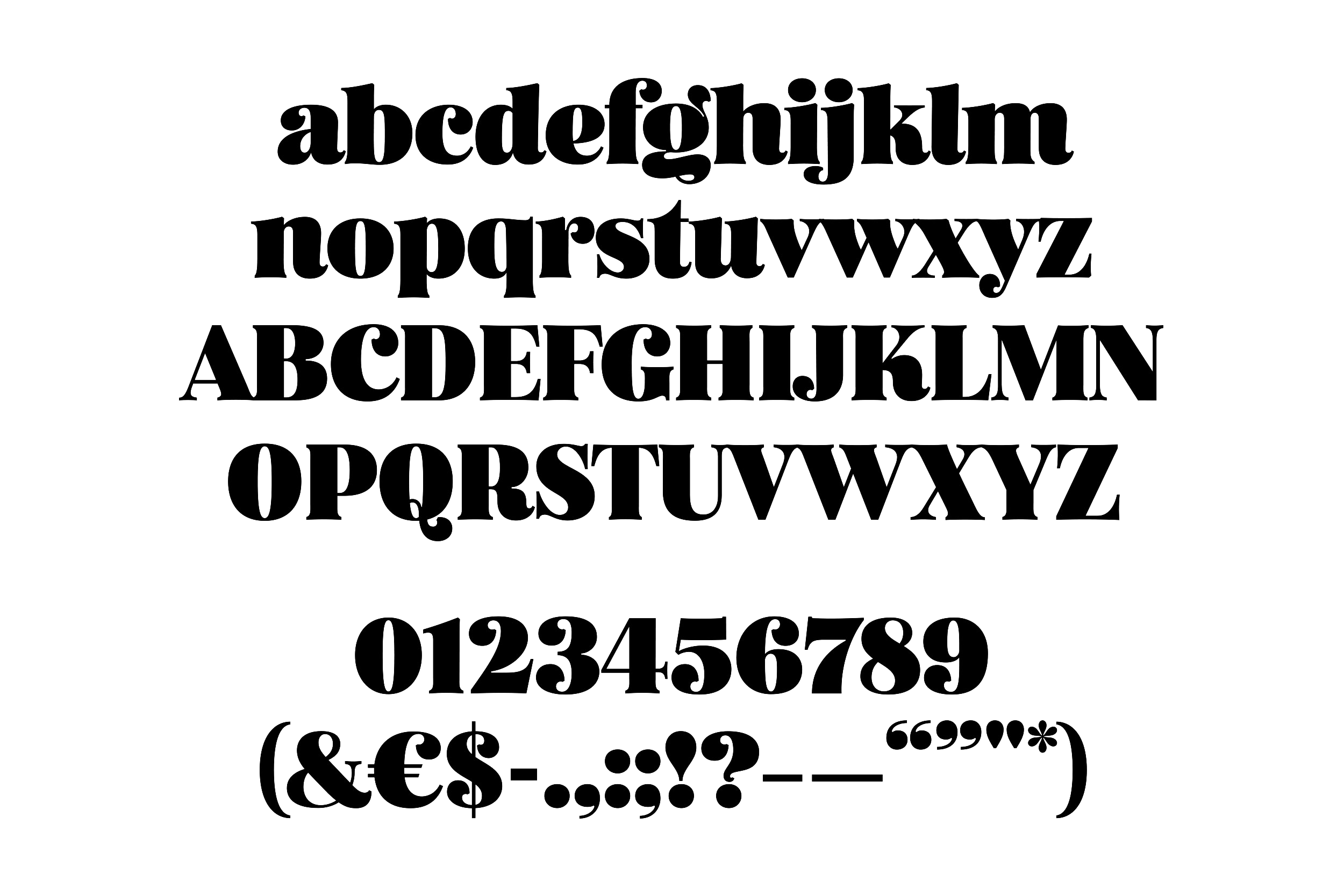
Poirot Display borrows its geometric structure from the Modern letter. However, the typeface diverges from its formal origins through its bouncy curves. This creates a quirky rhythm reminiscent of the iconic Belgian detective. Poirot Display is best appreciated when used in large headlines.

You can buy the type specimen print (send me an e-mail!). Hand printed in Antwerp in a limited edition of 50 (A1). Signed and numbered on the back.